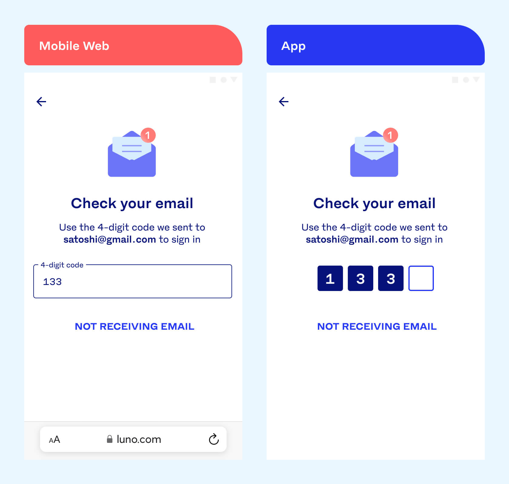
When I joined Luno in 2019, I noticed that the component we use to enter codes, was different between our web and mobile apps; the web app used a single input, while mobile apps were using a block input.

I liked the block input as it simply helps explain how many digits you need to type in without having to read anything. Besides that, it looked nicer and more appropriate for entering codes. I asked around about how we could align the platforms, but I sensed that there wasn’t an appetite for it at the moment. There were probably bigger problems to solve at the time, so I parked the idea.
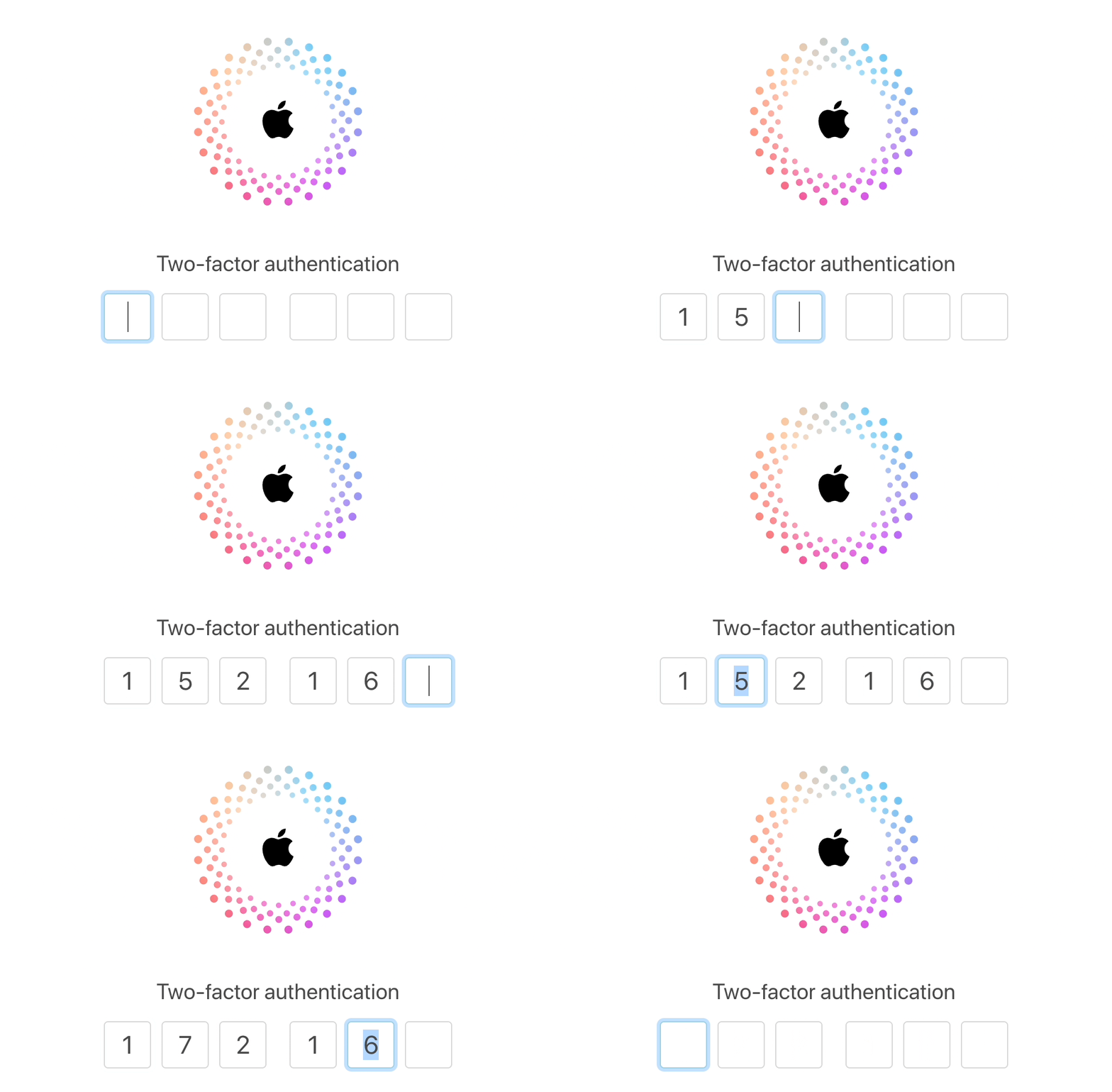
At the end of last year, I had a bit of headspace to think through the component again. I looked at various companies and how they implemented similar components. Apple’s implementation was incredibly well thought through so I decided to zoom in on it.
I dissected it by recording dozens of videos of each of the different interactions and turned them into a list of features. I’ve added the full list at the end of this post, but here is 1 of them illustrating the detail of these interactions:

I continued to work closely with our principal web engineer to refine it and get it into a state where it was ready to go into a technical design doc. 2 of our team’s web engineers did a fair amount of research to figure out what the best way would be to build it. We found a couple of Angular libraries but they were quite rough around the edges so we ended up picking 1 to build on top of.
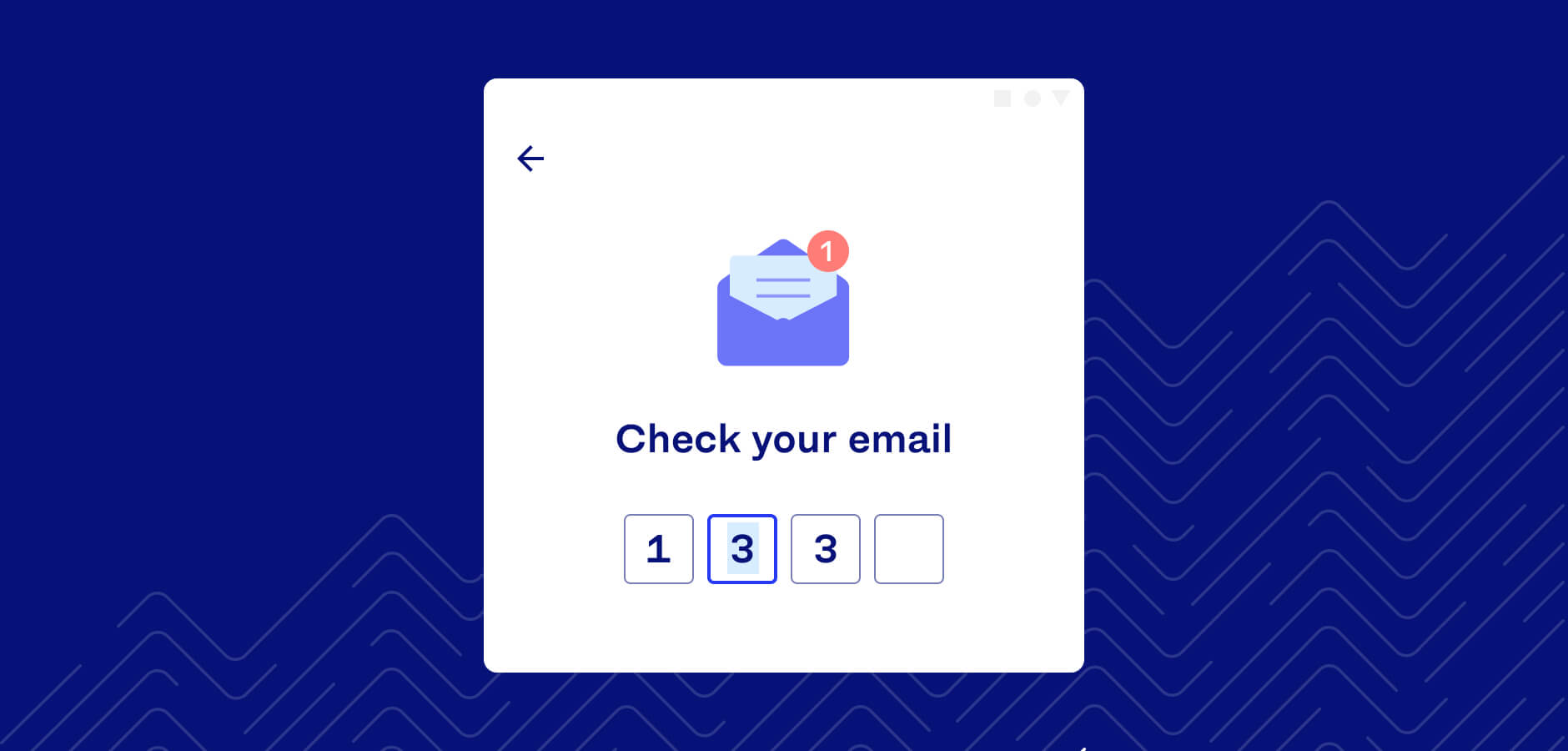
Some parts of the component were quite tricky, but we eventually got it just right.
I had very little reason to believe that the new component would hurt conversion, but just to make sure, we decided to set up an A/B experiment. After a couple of weeks, the experiment proved to be a massive success: we had a whopping 0.03% lift with the new component! 😅
Of course, this number is statistically insignificant, but it was a success because it wasn’t underperforming. Getting the numbers were important, but the heart of the project was to craft something beautiful, something that works as well as it looks. This component hopefully reflects that care.
I’m really proud of what we’ve built together as a team. Clarissa and Brendan have been incredibly patient to see this project through to the end and I want to thank them for caring about it as much as I did.
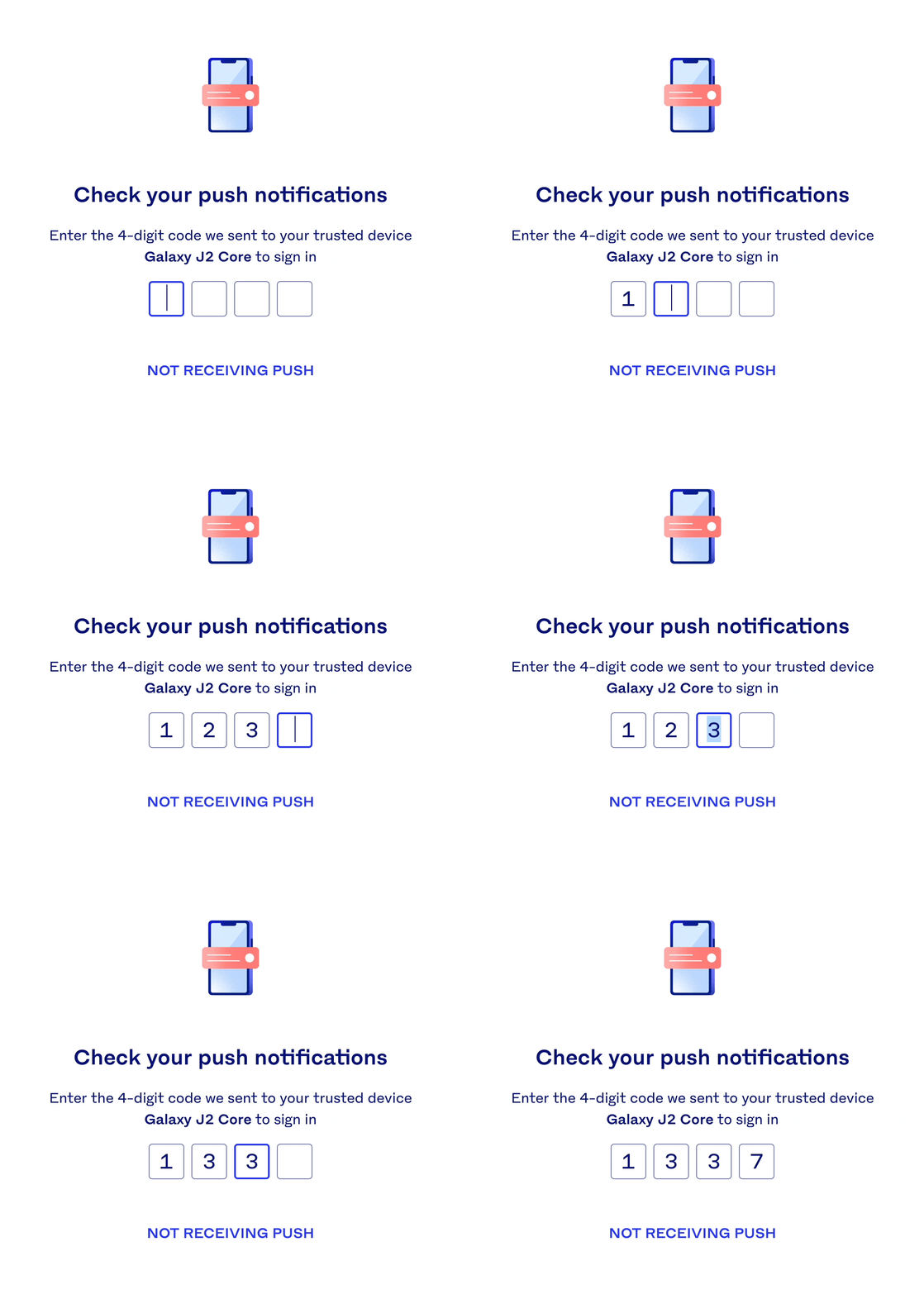
We’ve now rolled it out to all instances on the Luno web app. As a next step, I would love to explore how we can open-source the full component. That might take some time, so, until then, here’s what it looks like now and the full list of interactions and states.

• • •
General
- Where only the num input field is used on a page, the first block is focused by default
- Only numbers should be allowed: If letters are used, nothing should be entered and the focused block should remain focused
Entering numbers
- Typing a number in a block automatically moves you to the next one and keeps it focused
- If a block is already filled and a number is typed in, replace the existing number and move to the next block
Pasting numbers
- If a code is pasted, all blocks should be filled from the focused block onwards
- If a focused block is filled and a single number is pasted, replace the existing number and move to the next block
Deleting numbers
- If the focused block has a number, delete the number and stay on the block
- If the focused block is empty, move to the previous block and delete that number
- If the 1st block is empty, stay on it when trying to delete it
- Numbers can be deleted using the Delete or Backspace key
Moving between blocks
- Arrow keys move you between blocks and select the number if one is present
- Tab moves you 1 block forward and Shift + Tab moves you 1 block back
- Clicking to the left or right of the number, should force the number to be selected
- Moving between blocks using the arrow keys, automatically selects the number if one is available
Validation
- Entering the last number should automatically check the validity of the code
- All blocks become unfocused on validation
- If a code is valid, move to the next screen
- If a code is invalid, show an error below the blocks and clear them
